SAHSU has produced the atlas for England and Wales only as the data used are currently held by SAHSU for use in its current research programme. The English and Welsh health data are from the Office of National Statistics (ONS) going back 25 years. SAHSU has permission to hold this data for use in a range of health studies including the atlas. Scottish and Northern Irish data are held by separate national bodies for which SAHSU would need to obtain separate permissions to hold. SAHSU’s core funding comes from Public Health England as part of the MRC-PHE Centre for Environment and Health; it does not receive funding from the Scottish or Northern Irish Governments.
The availability of national environmental data at small area level is limited and in the majority of cases was only available for England and Wales (and for some environmental maps only England). The additional modelling done by SAHSU for this atlas was done to make the maps compatible with the health conditions – therefore covering only England and Wales.
SAHSUs past and current work includes data from all counties in the UK including studies on landfill , incineration and electromagnetic frequencies. A list of selected SAHSU publications can be found on our website .
The health data came from official national data sources in England and Wales: mortality and birth statistics came from the Office for National Statistics (ONS) , while cancer registrations came from ONS and from the Welsh Cancer Intelligence and Surveillance Unit (WCISU). Census data was used for area-level population and deprivation measures. The data used in this atlas is not SUS/HES data and is not related to Care.data.
The registering of a birth or a death is a legal requirement and ONS collate and hold this data which is then available to use provided the appropriate permissions and controls are in place. Cancer registration in England is conducted by eight regional registries who then submit their data to ONS. Wales, Northern Ireland and Scotland each have one, national, cancer registry. These registries have legal support to collect data relating to cancer under Section 251 of the NHS Act 2006 (and formerly under Section 60 of the Health and Social Care Act 2001). In order to have this permission the cancer registries must inforce strict rules about patient confidentiality and no breaches of confidentially have happened in the 40 year history of the registries. While individuals have the legal right to withdraw consent to be included in the cancer registers if large numbers of individuals did so this would severely limit the usefulness of cancer registration data.
The archived census record (the one that is kept closed for 100 years) is created under the provisions of the Census Act (for statistical purposes) and held by ONS under the provisions of the Statistics and Registration Service Act. This is not an administrative dataset in the way that the cancer registration data is. The census records have been deemed to be public records, and are held by ONS (until they are opened) with the authority of the Lord Chancellor. The database records, from which the statistics are produced and analysed are anonymised and cannot be related back to identifiable individuals.
In order to hold and use these datasets for research purposes SAHSU has:
SAHSU has strict confidentially protocols in place and never holds the names or contact details such as telephone numbers or email addresses of individuals. Before being able to access the data, researchers must sign the SAHSU confidentiality form, which includes a written acceptance of the security controls and guideline on the processing of patient data. All researchers must be approved by the SAHSU Director or Assistant Director. The level of data access granted is based on the needs of the researcher, the study and the data. SAHSU has a microdata release policy as part of its Security policy; this complies fully with all data provider requirements.
Sensitive data held by SAHSU are encrypted within SAHSU’s highly secure database; the encryption method conforms to government data protection standards. Database access is audited. All research involving data with any risk of potential identifiability (e.g. small area level data with low counts) is conducted on the private network, an air-gapped stand-alone network with no connection to either the internet or to the Imperial College IT network. Any outputs in reports or papers are checked; small numbers of counts (<5 cases) in specified geographical areas in tables are suppressed to prevent inadvertent identification of individuals. SAHSU does not share data with third parties.
The health data came from official national data sources in England and Wales: mortality and birth statistics came from the Office for National Statistics (ONS), while cancer registrations came from ONS and from the Welsh Cancer Intelligence and Surveillance Unit (WCISU). Population and contextual data came from ONS. Health and population data at a coarser spatial resolution (i.e. regional level) are readily available to download from the ONS website; the more detailed health data used to produce the maps in the atlas can be obtained from ONS on request provided the correct permissions and data security are in place.
With permission from the data providers we are able to make the data presented in the health maps available on request. The data available are the SAHSU created smoothed deprivation adjusted relative risks with uncertainty intervals for each health outcome and are provided with geographical identifiers (ward level). The modelled health risks were derived from count data (i.e. number of cases). We do not have permissions to provide the count data for each small area mapped – if you need these data you will need to contact ONS and/or WCISU directly. Health and population count data at a less fine spatial resolution (i.e. regional level) are available to download from the ONS and WCISU websites.
The data used to create the environmental maps are owned by a range of data providers but the majority of the environmental agent maps required at least some geospatial modelling by SAHSU. SAHSU has permission to present these data as maps but ownership of the underlying data is still held by the original providers. We have permission to make the maps on NO2, PM10 and sunshine duration available. The other environmental data would need to be considered on a case by case basis and may need an application to the original data provider.
It is important to note that it is not possible to make direct causal links just by comparing the mapped environmental agents and health conditions. More information about other factors that might affect disease risk and further study would be needed, including at individual level, before any conclusions about possible causal links could be made.
Any outputs using the data must include statements of acknowledgement, which will be provided with the data files.
If you would like to obtain the relative risk health data or the environmental data please use the contact us form.
What we have been able to show in the atlas is constrained mainly by data availability but also by time and resources. It would be possible to present maps of more cancers and mortality outcomes but in order to get the atlas completed we have focus on conditions with a potential to be influenced by environmental factors. Other important health conditions such as autism, asthma or diabetes could not be included in this atlas due to difficulties obtaining the most relevant data. For example, a map of asthma would be difficult as there is no national register of asthma. Asthma mortality is very rare so would not provide accurate maps. The best measure of local variability in asthma incidence would be from GP records, but these data are not currently nationally available. We have focused the atlas on environmental agents so we have not included maps of lifestyle factors such as alcohol use or diet.
The application needed to land on one of the maps for each condition to prevent the menu becoming too long for the screen. It would be difficult to code the maps to land on different sexes for different conditions. Therefore the first page for prostate cancer is the female map (see How do I switch between maps for each sex? below) which does not exist – the male button needs to be selected to switch to the correct map for prostate cancer.
The atlas does not take migration into account and this information is not available in the national datasets used. This information would be important to consider if attempting to demonstrate a causal association between an environmental exposure and a disease or condition but this is not something attempted in this atlas.
The Environment and Health Atlas for England and Wales is an independent publication produced by the UK Small Area Health Statistics Unit (SAHSU), part of the MRC-PHE Centre for Environment and Health which is funded by the Medical Research Council and Public Health England. The atlas was published as a book by Oxford University Press on 24th April 2014, and contains more detailed information to put the results in context. The atlas draws on the knowledge of mapping and the use of health and environmental data that SAHSU has accumulated over 26 years of conducting environmental health research.
The atlas provides maps of the geographical variations for a range of health conditions and environmental agents at a small-area scale (census wards), which is a much higher spatial resolution than available elsewhere. It also provides contextual information such as known risk factors for the health conditions and a summary of what is known about possible health effects associated with the environmental agents mapped in the atlas.
The maps have been developed as a resource for those working in public health and public health policy and for the general public to better understand the geographic distribution of environmental factors and disease and to identify questions for future research. However, it is important to note that simple comparison of the maps of environmental agents and health conditions cannot be used to suggest causal associations. More information about other factors that might affect disease risk and further statistical analysis would be needed, including at individual level.
Similar geographic patterns of environmental agents and health conditions does not mean the association is causal – i.e. where [ward X] has both high concentrations of [Y environmental agent] and higher risk of [Z disease], it does not mean that Y caused Z. The health condition maps show average long-term risks for an area. Each individual living in that area will have different risk factors such as genetic factors, age, whether they smoke or not, diet and exercise patterns, other medical conditions etc. that may have important influences on their individual risk. Similarly, the concentrations of an environmental pollutant in an area may not reflect how much of the agent the person has individually been exposed to, especially if they have recently moved into that area.
A simple comparison of maps can sometimes be useful to develop hypotheses about whether there might be a causal link. However, further study would be needed, including at individual level, to investigate whether associations might be causal or not.
The atlas has been developed to be accessible to a range of audiences, including researchers and health professionals, policy makers and the public.
We present maps for women and men for 14 health conditions of public health importance and four selected types of environmental agents in England and Wales, listed below. The print version of the atlas also includes radon. Interactive radon maps are available from Public Health England here.
Health conditions:
Environmental agents:
The health conditions selected are of public health importance (for example, cancers and some common causes of death) where environmental risk factors may potentially contribute to risk of developing that condition. We have included stillbirth and low birth weight, as the developing fetus is potentially highly sensitive to environmental agents.
Other important health conditions such as asthma or diabetes could not be included in this atlas due to difficulties obtaining the most relevant data. For example, a map of asthma would be difficult as there is no national register of asthma. Asthma mortality is very rare so would not provide accurate maps. The best measure of local variability in asthma incidence would be from GP records, but these data are not currently nationally available.
The following environmental agents were chosen for the maps:
And additionally in the print version of the atlas:
We call them agents rather than hazards because sunlight can be beneficial as well as harmful to health and agricultural pesticides and THMs in drinking water are potential but not proven hazards.
The selected environmental agents were chosen because of the availability of good quality data at very high spatial resolution on a national level and their potential to be associated with health conditions. We were restricted in our choice of environmental agent as data were not always available, particularly at national level or at fine spatial resolution.
The health maps can be used to provide a baseline picture of the longer term geographical variability at a small-area scale (census ward level). This is a much finer spatial resolution than in most previous atlases. Health conditions are generally averaged over a 25 year period (1985-2009). Health maps are adjusted for deprivation and age distribution in each area, so these should not explain the geographical patterns. The environmental maps describe geographic patterns of some important environmental agents, again at fine spatial resolution.
The maps by themselves cannot answer why geographical patterns exist, but they can be used to help identify important questions for further research and potential policy interventions.
The atlas cannot be used to provide evidence of clusters of disease. The health maps shows averaged area-level risks over a long time frame (usually from 1985-2009, i.e. 25 years) that have been adjusted to allow for small numbers of events (smoothed). Additional information and different analysis techniques would be needed to demonstrate clusters of disease.
The maps do not show the current risk an individual has of developing a disease, which will depend on other factors including genetic susceptibility, lifestyle and whether they have other medical conditions.
The environmental maps show averaged area-level exposures related to specific years, which may not correspond to, an individual’s exposure to an environmental agent. The environmental agents mapped are:
And additionally in the print version of the atlas:
The atlas provides health maps at census ward level (average population 6,000), giving a finer spatial resolution than available previously to better show and understand geographical variability. Previous UK atlases have used coarser spatial resolution e.g. at district, NHS board or primary care trust level.
Health maps usually adjust for age and sex, but the atlas maps are additionally adjusted for deprivation and for small numbers, to help identify variations in disease risk that may potentially be due to environmental risk factors.
The atlas is fully interactive down to ward or postcode level and contextual information is given. For health outcomes, a graph of risks in the selected ward compared with all other wards in the same county can be displayed and we also provide the number of people living in the ward. Information about national rates and major risk factors are provided.
The health maps use the relative risks for each ward not actual numbers of cases or rates. While these risks are based on actual numbers of cases they have been adjusted for age and deprivation as well as “smoothed” to account for small numbers. It is therefore not mathematically possible to work back from a smoothed relative risk to the actual number of cases in a ward over a twenty five year period. In addition, the underlying data for these maps is not online and is not available to download.
SAHSU and does not hold names. Each health record is encrypted and held on a secure stand-alone private network (i.e. with no links to the internet or university networks) following strict information governance procedures under permission from the National Research Ethics Service, the Health Research Authority, Public Health England and the data providers.
The health conditions are mapped at small-area (census ward) level and generally show relative risks for a 25 year period (1985-2009), presented as separate maps for males and females. The relative risks represent the risk of an area (ward) relative to average risk in England and Wales. These are adjusted for age, deprivation and chance fluctuations due to small numbers. Maps include two birth outcomes (incidence of stillbirth and low birth weight), nine cancers and mortality from heart disease, kidney disease and chronic obstructive pulmonary disease (COPD).
Census wards are areas defined by the Office of National Statistics for the collection of census data. They are a mid-level administrative unit and are fre¬quently used in spatial epidemiological studies. They are based on electoral wards, but they do not always reflect the actual wards in a local authority at any point in time. These census wards are useful for research as they provide a stable geography over time and they are small enough to allow local patterns to be seen, whilst mostly ensuring sufficient numbers of cases for statistically valid results. Census wards in England and Wales con¬tain a minimum of 1,000 people and have, on average, 6,000 people living within their boundaries.
The underlying causes of mortality and cancer incidence that form the basis of the maps presented were coded according to the International Classification of Disease (ICD) system.
This is an internationally recognised standard system for classifying the causes of morbidity and mortality. It also provides rules to establish the underlying cause of death from a medical certificate, allowing for a uniform derivation of information, aiding comparability between places and times.
It is important to note that the mortality data used is based on deaths registered, rather than deaths occurring, in a calendar year. This may have an effect on trends for some causes of death such as suicides, drug-related deaths and traffic accidents (though this is unlikely to effect the mortality outcomes used in the atlas) as there can be long delays to the death registration process for these causes of death. Further information on registration delays for a range of causes can be found on the ONS website.
| Health condition | ICD 9 | ICD 10 | Years |
|---|---|---|---|
| Lung cancer incidence (Trachea, bronchus and lung cancer incidence) | 162 | C34 | 1985–2009 |
| Breast cancer incidence (female) | 174 | C50 | 1985–2009 |
| Prostate cancer mortality (male) | 185 | C61 | 1985–2009 |
| Malignant melanoma (skin cancer) incidence | 172 | C43 | 1985–2009 |
| Bladder cancer incidence | 188 | C67 | 1985–2009 |
| Leukaemia incidence | 204–208 | C91–95 | 1985–2009 |
| Brain cancer incidence | 191 | C71 | 1985–2009 |
| Liver cancer (liver and intrahepatic bile ductcancer) incidence | 155 | C22 | 1996–2009 |
| Mesothelioma incidence | 163 | C45 | 1985–2009 |
| Coronary heart disease (CHD) mortality | 410–414 | I20–I25 | 1985–2009 |
| Chronic obstructive pulmonary disease (COPD) mortality | 490–492, 494, 496 | J40–J44, J47 | 1985–2009 |
| Kidney disease (KD) mortality | 580-599 | N00-N39 | 1985–2009 |
| Reproductive outcomes | |||
| Low birth weight | Live births <2500 g (denominator – live births) | 1986–2009 | |
| Stillbirth | Stillbirths >24 weeks (denominator – live and still births) | 1992–2009 |
A census ward has an average population of approximately 6,000 people; this is small enough to show local spatial variations whilst giving enough cases over a twenty-five year period to provide some statistical stability in the data.
Many of the health conditions being mapped are very rare. A 25 year period contains enough cases of the condition in question to be able to map health risks as well as provide information on the long-term patterns of disease. The atlas does not aim to identify and investigate clusters of disease (for which different statistical techniques will be more appropriate).
The relative risk is the risk of an area (ward) relative to average risk in England and Wales.
The maps use a two-colour scale to present nine categories of relative risk. The middle category (in white) represents a risk similar to the average for England and Wales and the different colours are used to show areas with risks higher than average (in orange) or lower than average (in purple). The national rates are provided for each health condition in the contextual information to the right of the health maps.
We have not presented the rates for each ward because for many of the health conditions the numbers of cases are very small and rates based on a small number of cases are not reliable. By using risks instead of the rates we were able to use a technique called “smoothing” which accounts for chance fluctuation and makes the relative risk estimates more reliable.
Deprivation is a measure of socio-economic status and there are several different ways to represent this. In this atlas we have used the Carstairs index, which is a standard measure of deprivation, derived from information from the census. It describes deprivation in terms of access to goods and services customary in society. The Carstairs index combines four variables from ward level census data for households: 1) unemployment of males over 16 years of age, 2) car ownership, 3) numbers of people per room, 4) social class of economic active head of household.
Deprivation is strongly associated with both the risk of a disease and also with important disease risk factors such as smoking. Therefore maps not adjusted for deprivation may reflect differences in lifestyle factors rather than possible environmental factors. Adjustment for deprivation is commonly used in epidemiological studies looking at environmental risk factors. While it is very important to adjust for deprivation, some pollutants tend to be higher in more deprived areas, so adjustment for deprivation may in some cases over adjust for (i.e. partially mask) risks associated with environmental factors.
Adjusting for age (also called standardising for age) adjusts for differences in disease risk that might result from different age structures in wards (e.g. more young people or more old people). This will particularly affect diseases that are strongly associated with age. For example, without adjustment, inner city wards that had much lower proportion of older residents might appear to have a lower risk of a cardiovascular disease or cancer when compared to rural wards that had higher proportions of older residents.Some or possibly all of the difference would be an artefact due to the differences in age structure of the population.
To explore how much age difference there is in different areas of the UK and how this has changed over time, we suggest you look at the ONS interactive tool "Ageing in the UK"
“Smoothing” was used when calculating the disease risks presented in the health maps. Smoothing is a statistical method used to adjust for chance fluctuations in disease risk that can occur when risks are calculated using small numbers of cases or small populations. The relative risk of each ward has been smoothed towards a combination of the national average and the averages of neighbouring wards. Smoothing will have relatively little effect on risks calculated for wards with larger numbers of cases and populations. A more detailed description of the Bayesian hierarchical model (BHM) used is provided at: [1] Richardson, S. and Best, N. Bayesian hierarchical models in ecological studies of health-environment effects. Environmetrics 14[2], 129-147. 2003 http://onlinelibrary.wiley.com/doi/10.1002/env.571/abstract More information on the impact of smoothing on the distributions of risks is given in the print version of the atlas.
Health maps for England and Wales are shown separately for men and women as both disease patterns and disease risk factors can vary by sex. For example mesothelioma is a rare cancer that is very closely related to asbestos exposure. It is extremely rare in women because most asbestos exposure occurs in an occupational setting, such as construction work and ship building, where most jobs are done by men.
The graph below illustrates how common the selected health condtions were in Great Britain. The data are from 2010 from Cancer Research UK (for all cancers) and the British Heart Foundation (CHD). The COPD and kidney disease data are from 2008 and the World Health Organisation and the Global Burden of Disease respectively. Rates for the first eight diseases are incidence rates (based on numbers of new cases). Rates for the next five diseases (which are starred and below the line) are mortality rates rather than incidence rates.
Figure 1: Age standardised rates in Great Britain of health conditions in the atlas
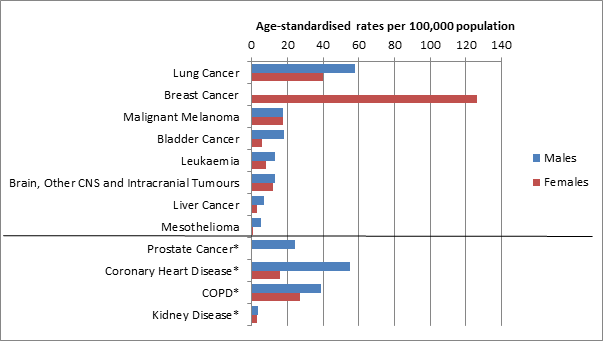
Most of the cancer maps are based on data on the number of newly diagnosed cases in a certain time period (incidence data). However, data on numbers of new diagnoses of prostate cancer (incidence) have been strongly influenced by the introduction of prostate-specific antigen (PSA) testing. We chose to show mortality for prostate cancer because geographical patterns in mortality rates will be less influenced by geographical variations in PSA testing than incidence rates, so are a better estimate of underlying prostate cancer risk.
The maps show mortality (deaths) for CHD, COPD and kidney disease but incidence (new cases) for cancers (except for prostate cancer). This is because there is a national register that records new cases of cancers, but no national register to record new cases of CHD, COPD or kidney disease. Mortality data (available from ONS) has been used in the atlas where incidence data are not available, except for prostate cancer.
The atlas shows average risks for an area (ward) compared with the national average, this is not the same as the risk to an individual who will have a collection of individual risk factors (genetic, lifestyle, previous disease and life events). Also, the health maps show relative risk not the absolute risk.
The relative risk tells us how much more or less likely a health condition is in one group compared to another group. For example the risk of bladder cancer in smokers has been estimated to be three times higher than in non-smokers; this is not telling us anything about the actual risk of developing bladder cancer. This difference between the types of risk is explained well on the Cancer Research UK website:
http://scienceblog.cancerresearchuk.org/2013/03/15/absolute-versus-relative-risk-making-sense-of-media-stories/
The understanding uncertainty website also has a useful animation to help understand the difference between the two types of risk:
http://understandinguncertainty.org/files/animations/RiskDisplay1/RiskDisplay.html
The data originally available to SAHSU at the time of analysis was until 2009. The data were checked and cleaned before being analysed and the maps took time to design and produce. The book was extensively peer reviewed and several workshops with Sense About Science have been held to try to present the information in a way to make it accessible and understandable to a wide audience. Following this changes were made and there were a further nine months between submission to publisher and publication of the book.
Risks presented are long-term averages for the area for the period 1985-2009. There are many different individual risk factors for disease, including age, sex, genetic factors, whether or not a person smokes and their diet and exercise levels as well as pre-existing conditions such as high blood pressure. . So the reasons for higher (or lower) risks in an area are complex and do not necessarily represent risks for an individual.
Lack of availability of data at a high spatial resolution for most or all of England and Wale affected which years of data we were able to provide for the environmental maps. Several of the maps relate to 2001 and this falls within the time period of the health mapS.
The maps represent specific time periods and may not be representative of current levels.
The environmental maps are presented at the highest resolution possible depending on the data available. For example, air pollution estimates are presented at 100 m grids, disinfection by-products at water supply level and pesticides at census ward level.
When a postcode search is carried out, the atlas looks for the corresponding geographic point representing the postcode centroid (a postcode centroid is the geometric centre of the actual postcode area). This centroid has a specific pair of x-y coordinates which is then used to locate and extract the estimated measure from the underlying modelled environmental agent data.
The maps show average concentrations for each area but concentrations may vary within that area. Concentration in an area is not the same as the exposure for an individual living in that area. This may be affected by factors such as their job, house, pre-existing state of health, age and lifestyle choices. The important metric for human exposure is the dose – the amount of a pollutant that actually enters the human body. Dose may further be considered as the dose received by the organ or organs affected, or the biologically effective dose.
Note that the environmental maps at area level are not the same as dose to an individual.
No. Simple comparison of the environmental and health maps cannot be used to show causal associations. More information about other factors that might affect disease risk and further study would be needed, including at individual level, before any conclusions about possible causal links could be made.
Sunshine is a major source of ultraviolet (UV) exposure. Skin exposure to sunshine increases vitamin D levels, which is good for general and bone health, but is also associated with increased risk of skin cancer. The amount of solar radiation individuals are exposed to is influenced by the amount of radiation that reaches the earth’s surface as well as individual factors such as skin colour, sunbathing, holidays in sunny places and use of sun protection. Therefore, the sunshine map does not directly indicate dose of ultraviolet (UV) exposure for individuals living in those areas.
The maps of agricultural pesticides were originally produced for a separate study and the data came from The Pesticides Usage Survey (PUS), conducted by The Food and Environment Research Agency. Areas that were not surveyed in the PUS will be missing from the maps and there were no data available to be able to provide equivalent maps for Wales.
The chlorination disinfection by-products data were obtained for a specific study and was supplied by various water companies. Not all water companies in England and Wales participated in the study, which is why there are areas missing from the maps.
The published version of the atlas provides more detailed information on what is known about risk factors for each of the health conditions, and potential health risks associated with the environmental agents in the maps. Public Health England is also a useful resource to find out about potential health risks from environmental agents. The NHS choices website is a useful resource for learning more about health conditions and their risk factors.
We suggest that you contact your GP, if you have any specific health concerns.
There are many possible risk factors for leukaemia, including exposure to ionising radiation, occupational exposures and smoking, and these may differ by area. Before making any assumptions about a possible link with e.g. an industrial installation, more information about other factors that might affect disease risk and further study would be needed, including at individual level, and in other areas.
The UK Small Area Health Statistics Unit (SAHSU) at Imperial College London is a national centre established in 1987 to investigate potential environmental risks to population health, with particular emphasis on the use and interpretation of routine health statistics (such as births, deaths and hospital admissions) and development of the methodology for small-area studies. It is part of the MRC-PHE Centre for Environment and Health, a national centre for research and training in environmental health.
SAHSU is part of the MRC-PHE Centre for Environment and Health funded by the Medical Research Council and Public Health England. SAHSU is based at Imperial College London. SAHSU’s core funding comes from Public Health England although specific research studies may have additional funding from research councils, charities and government departments.
The level of interest in the atlas was far higher than had been anticipated with over 200,000 people accessing it in the first three days. Unfortunately this meant that some users had difficultly, especially on Friday morning, getting through to the atlas. SAHSU worked with Imperial College throughout the day to get more servers online to cope with the demand and it was working for most users by lunchtime on Friday. Apologies to those who were unable to get on to the atlas and hopefully this will not deter you from trying again.
The atlas uses census wards not electoral wards (see FAQ on census wards below). Census wards, while often similar to electoral wards, are designed to remain stable over time and not be affected by electoral boundary changes (which occur regularly to balance electoral populations ). The counties used in the atlas were those used by ONS for the 2001 census and as such will have some discrepancies with currency counties or local authorities.
At the top right hand side of the screen are two buttons, the 1st will switch between the health outcome and environmental agent maps. The second button labelled “Home” will take you back to the main website.
The drop down menu in the top left of the screen will enable you to change between different health conditions or environmental agents.
At the top right hand side of the maps there are two buttons with the standard gender symbols next to them. Clicking on the button next to the relevant symbol will switch between the male and female maps.
Type the postcode into the box called ‘Postcode search’ (top right of map under ward name) and then click search.
The clear button allows you to "unlock" your current selection. When a ward is selected all components (map, chart, legend and information box) will not update when hovering over different areas. The clear button can be used to unselect the ward and let the application update.
Click on the plus or minus buttons to zoom in or out as required.
This work is licensed under a Creative Commons Attribution-NoDerivatives 4.0 International License.
You are free to: Share — copy and redistribute the material in any medium or format for any purpose, even commercially. The licensor cannot revoke these freedoms as long as you follow the license terms. Under the following terms: Attribution — You must give appropriate credit, provide a link to the license, andindicate if changes were made. You may do so in any reasonable manner, but not in any way that suggests the licensor endorses you or your use. NoDerivatives — If you remix, transform, or build upon the material, you may not distribute the modified material. No additional restrictions — You may not apply legal terms or technological measures that legally restrict others from doing anything the license permits. Notices: You do not have to comply with the license for elements of the material in the public domain or where your use is permitted by an applicable exception or limitation. No warranties are given. The license may not give you all of the permissions necessary for your intended use. For example, other rights such as publicity, privacy, or moral rights may limit how you use the material.
